Common mistake of webdesign beginners
/* NO OFFENSE ABOUT THE TITLE */
(I also did pages like theone mentioned in here, but I improved myself and learned from critics)
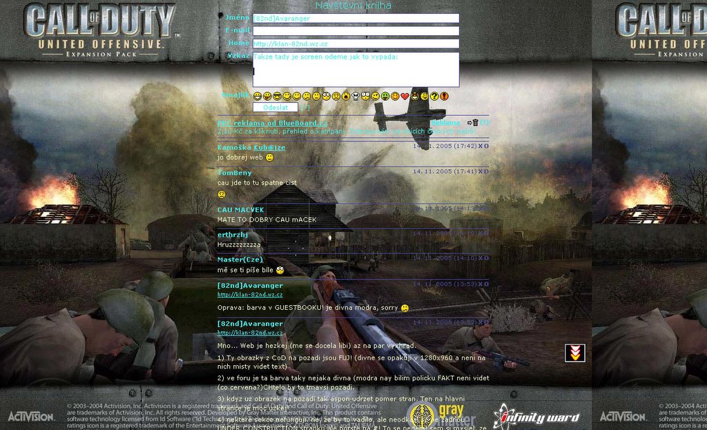
This screen comes from BiA CoD:UO klan website. From Guestbook. The firs mistake I can see is the image on the background. You can see the wish of the creator to ensure the guest that the guestbook is DEFINETLY about CoD. But usualy such images are useless and only lowers the readeability. The aqua color of the title text is quite good expect the fact that the textfields has white background. And the "yellow" text isn't good on the background picture.
How to make the layout better? At first you have to chnge the background picture (or better, remove it and use solid color) to somthing tileable. The mess-up with the text / titles / link colors to make everything readeable. Didn't help? Contact me on my ICQ# 325-102-524
OMG! I've forgotten the link!
related links:
http://www.klan-bia.wz.cz/
posted by Tomas Fejfar at 19:07 ![]()
![]()


0 Comments:
Okomentovat
<< Home